Improve Your Art by Drawing From Reference

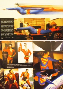
In Mythology: The DC Comics Art of Alex Ross, Alex Ross said on the use of live models, “Before that I have no idea how much I could grow as a draftsman. It was a huge turning point, because all through grade school I hadn’t so much as drawn from photographs. I’d always thought that you had to make it all up out of your head, and that’s how you did ‘fantasy’ illustrations. Now I wonder if I would have developed even sooner had I drawn from life as a child.”

Alex Ross is spot on with that comment. It is so true. Early in my drawing days, I felt the same way, that you were copying and NOT drawing if you had used references. It was only not too long ago that I started to draw from references. I think most artist has a lot of pride and feels that what they create has to be original, and anything that is referenced is cheating, and not really their own. What is art if it is not your own? I felt that way for most of my life. But now I don’t. And you have no idea what a breakthrough it has been for me. You have to get it out of your head if you still think referencing is cheating and not original. I guarantee you will be come a better artist once you start drawing from reference, or from live models as what Alex Ross likes to photograph and use. Seriously, I don’t think anyone can say that Alex Ross’s work is not original.

From Mythology: DC Comics Art of Alex Ross, showing his use of live models for references

The next time you want to draw something, make sure you have some references. Through the use of references, you are going to improve your skills by seeing how things really are. You will see, through real life, the forms, the highlights, shadows, bounce lights, etc. Eventually you will be able to draw convincingly without references, because you will have a great understanding of light and how to render any forms realistically. But even at that point, you should still use references, especially for more important drawings.

I use live references all the time. Just pose yourself or anyone else that is willing to be photographed. You can use natural window lights or artificial lights like a simple desk lamp. Whatever works. I fancy myself as an amateur photographer, and I think most artist do too=). So I have some professional photography equipments that I use for specific lighting. But you don’t have to have them, simple household lights will work just as well.

So next time, grab your girlfriend, boyfriend, wife, mistress, or your neighbor’s dog and take their photo for reference!
My Essential Tools for Drawing and Sketching

Hi everyone! Finally got around to doing some intro videos that I was always planning on doing. I got under the weather last week and finally got my voice back. So for starters, these are videos on my drawing tools. This is currently what I am using for all my sketches.

The videos are split up into 3 parts as it turned out to be longer than I had anticipated after shooting and editing. The videos and a summary of each is below.

These intro videos are somewhat basic, but nonetheless very important, especially if you are just starting out. And even if have been drawing for awhile, there are probably tips in there that you can try out. There is always something you can learn from your fellow artist. So I hope you find them helpful. And please do share any comments or tips that you might have of your own below.

http://youtu.be/_YEjAIFCoyw
Part 1 – Pencils HB, 2B, 4B, 5B. My primary pencils. The HB is for general sketching and outlines, plus some shading. The 2B is for in and around the midtone. I use the 4B for the dark areas, and the 5B for very dark areas. Set of Two, Dull and Sharp. Always have a set of each grade, a dull one and a sharp one. This allows me to switch back and forth quickly between the two depending on what my needs are.

http://youtu.be/YXlw7I0eQhA
Part 2 – Pencil Extensions. Use this to make your pencils longer and more powerful=). Mechanical Lead Holders. An alternative to wood pencils. Save money over the long term as leads are less expensive then wood pencils.

http://youtu.be/7qk-UHKoTZY
Part 3 – Kneaded Erasers. Intro and how to use them. Dab into paper to lift the lead instead of rubbing. Electronic Erasers. Use this to get sharp and clean highlights.

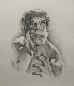
Lou Ferrigno Retro Hulk Sketch and the Effects of the Fixative Spray

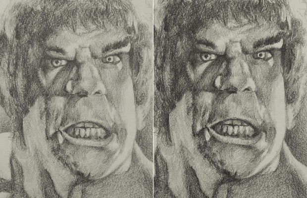
I would hate to leave a sketch unfinished, so I spent a little more time on this Hulk sketch and now I can call it done. Please click on it for a larger image.

What I wanted to briefly talk about was the effects of Fixative on a drawing. After each drawing, I always spray it with fixative to protect it. Even though it is just a quick sketch, I like to spray it so that it won’t smudge everywhere later on or onto my other drawings in storage. But there is a side effect to using a protective spray. The fixative will have the effects of darkening your drawing. That side effect has always been a plus for me, because that means I don’t have to sketch too dark, which saves me time. It is like applying a ‘contrast’ effect in Photoshop.

Check out the differences in the before and after picture. The left side is my original sketch and the right side is after it was sprayed with Krylon fixative. The results are quite drastic.

The Hulk Lou Ferrigno Sketch – Achieving an Artistic Look on Shadow Areas

Hi everyone. I wanted to record a video showing a quick sketch of Lou Ferrigno as the Hulk. I had placed my video camera above me and the drawing. Only after I have finished recording what I wanted to show, did I realized that my head was in the way of the camera=). What a stupid thing to do. I guess that is all trial and error for a newbie like me. Here’s how the video looked.

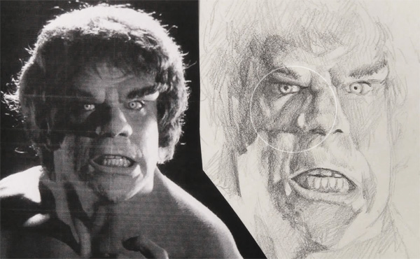
So in order to actually show the sketching process again, I continued on to the right side of the drawing. Which is the video you see at the bottom of this post. The proportions on the face are off from the reference as I drew it rather quickly. Had I wanted to look exactly like the reference, I would have used a lightbox to trace the main features. Yes, I do trace! And most artist do too. But that’s another story, we’ll talk about that another time.

What I really wanted to talk about is how you can render the shadow areas. One of the things that makes a drawing artistic and more captivating is the liberty that an artist can take with it. Instead of drawing it as you perfectly see it in real life or from reference, you can make it more interesting. One way to achieve that is how you render the shadow areas. On the picture of the Hulk reference and sketch, look specifically at the shadow  that is cast by the nose. In the reference, it is completely dark as the photographer intentionally removed any kind of bounce light on that area. But on the sketch, I left the shadow areas lighter than the edge of the shadow. This makes the sketch more artistic and less realistic. You will see this method on many other drawings by other artist. They rarely fill in the shadow areas completely dark, unless it is a specific dramatic feeling they want to achieve. Give it a try the next time you are sketching dark shadow areas.

Here is the video for the remainder of the drawing. The video is played at 4 x the actual speed.
Do you find this kind of video useful?

Good Hair and Squinting Your Eyes During Shading

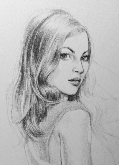
I am back at rendering hair again. I suppose you can’t avoid it if you want to draw a pretty face. As I am drawing Andrea (Sherry Jackson, doesn’t look like her yet) from Star Trek TOS, or any other drawing, I am always squinting my eyes when shading. So I figure this would be a good time to briefly touch on this subject.

The reason for squinting your eyes when shading is to assist you in seeing the values of your shading. In a way, you are ‘zooming out’ of the drawing to get a overall or bird’s eye view of your drawing. I find this extremely important for hair rendering. By squinting, I am able to see the overall flow of the hair, and it is the overall flow that is crucial in rendering good looking hair. Not just for the hair itself, but for the whole drawing.

The hair is very dynamic and you can use the flow to guide the viewer’s eye to wherever you want it. In the drawing, If you look at the curl right under her jaw, that curl helps to stop your eyes from going down further. Then the strand next to it curls toward the face, forcing your eyes to swing back to her face.

In my opinion, most of the time the hair rendering does not need to be overly complicated or hyper realistic. It just needs a good dynamic flow. It does take some planning. Just start with the major strands. Once you like how it flows, keep working in more minor strands to make it believable. Beware of putting in too much details on the hair, as it might attract too much attention and draw the viewer from your main focus. Unless your drawing is all about the hair. So as much as I find it painful to rendering the hair sometimes, a little grunt work really does make the difference. We will see how it turns out when I am done with this Andrea drawing.