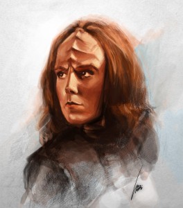
 I had an urge to do quick sketch of a Klingon women (don’t ask why), so I decide to draw Klingon Ambassador K’Ehleyr played by Suzie Plakson. Well, the sketch turned out horrible! It usually happens when I try to draw too fast. It ends up with the dark tones being too dark everywhere. With erasing and redrawing, it just turns into a mess. You really can’t erase too much on paper because it takes away the grain or tooth of the paper. Drawing on it then becomes slippery and you end up with shading blotches. So anyhow, I was at the point of tossing it into the trash until I gave it my last effort of salvaging it by taking it into Photoshop for some color.
The color turned out okay but rather boring. I wanted to make it more stylized and artistic, so I simply used a mask to blend the two together. It is a quick process in Photoshop and works quite well. Here’s how it went.
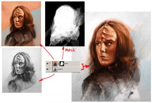
Artistic look by painting a mask in Photoshop
 Once you have your sketch painted, just put the painted layer on top of the sketch layer. Then create a mask for the painted layer. In the mask, everything you paint white will show the painted layer, black will make it transparent and show the bottom sketch layer. Any shades of grey will be a blend between the two. Nothing really special here, just your basic mask.
I do like to use this method because it is very flexible and it allows you create a nice blended look without modifying either of the original layers. Keep painting the mask until you get something you like. Now a very important shortcut key to use in this process is the shortcut key X. The X allows you to switch your current brush color selection from Foreground to Background and vice versa. Since you are painting the mask, Photoshop automatically sets the two values to black and white. You need to switch back and forth quickly because you will notice that you will be painting with blacks and whites constantly to get the artistic blend that you want.
Click on the image above to see my Photoshop layers. In the final image, I did add some whites to give it more of a visual pop. That layer is not shown, but you get the idea. Hope you find this helpful. Please share any comments or work-flows of your own in the comment section below. Thanks, -Wei